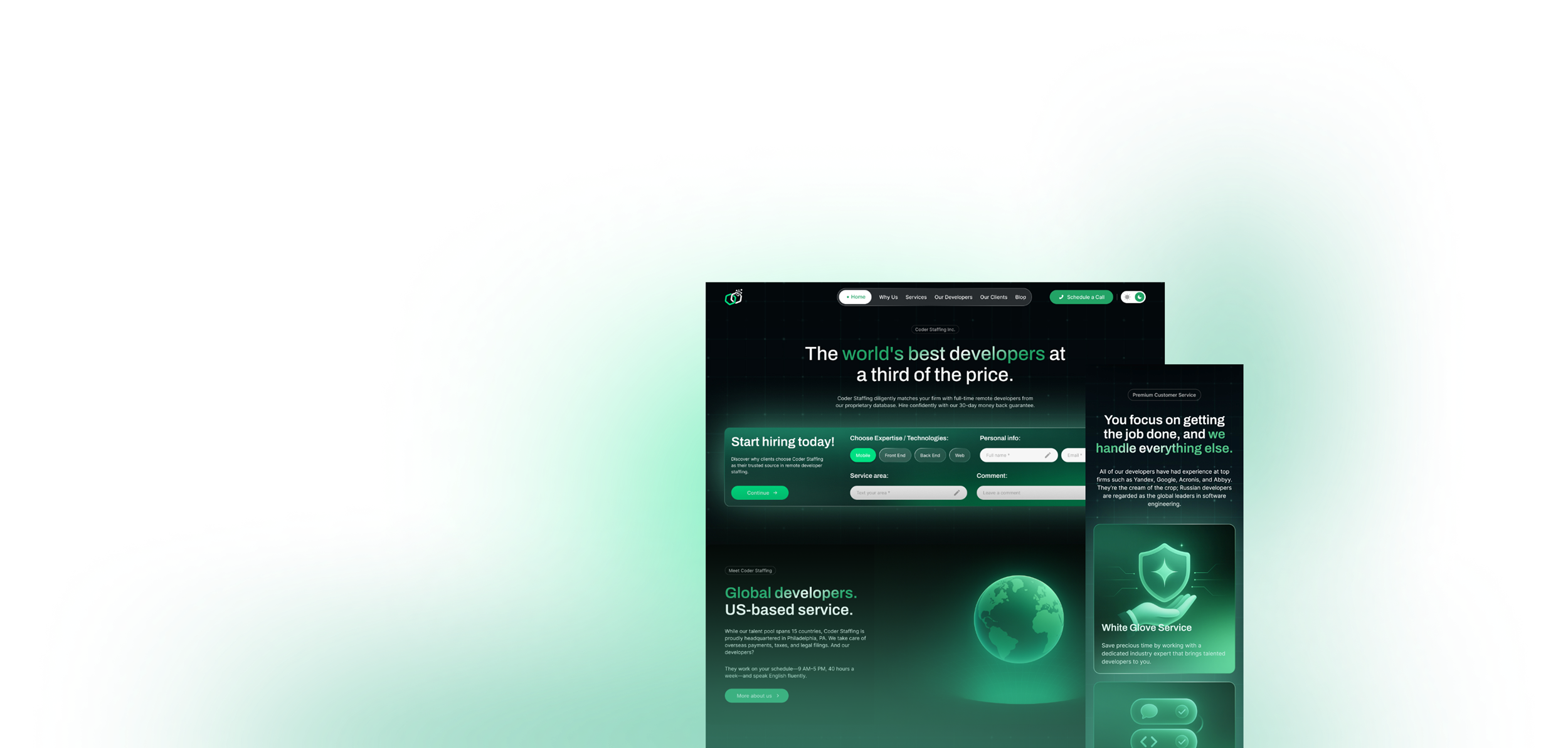
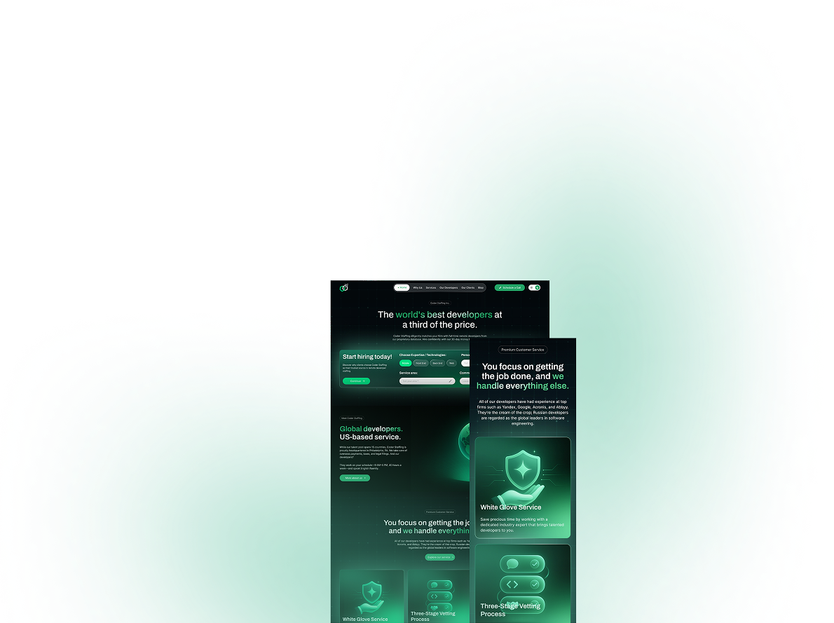
Website WorldPress

Case Study: Coder Staffing

Client: Coder Staffing
Location: USA
Industry: Tech

About the Project

Coder Staffing is a digital agency that connects firms with highly skilled IT professionals worldwide. With a talent pool spanning more than 15 countries, Coder Staffing is committed to thoroughly vetting and providing only the most qualified developers, fully dedicated to clients’ schedules and projects on a full-time basis.

The original website, while relatively user-friendly, lacked key usability features, full responsiveness, and a modern aesthetic. Our task was to completely revamp the website to overcome these shortcomings, enhance user-friendliness, and deliver a modern look and feel.

Our goals

  • Revamp the website's visual identity by introducing a clean, modern design with refined visual elements, typography, and a sleek look that aligns with contemporary web standards, ensuring a sophisticated and engaging user experience.

  • Implement light and dark website themes, allowing users to switch between themes, ensuring a more comfortable browsing environment.

  • Preserve the current site structure to maintain familiarity and user-friendliness, while addressing all of the shortcomings of the previous website.

  • Highlight the most recent high-profile clients to reinforce credibility and position Coder Staffing as a trusted partner for top-tier global firms.

  • Optimize website responsiveness to ensure a flawless browsing experience, fast load times, consistent layouts, and fluid adaptation to various screen sizes and orientations, delivering reliable performance and accessibility across all devices.

Steps of the Project

The project was divided into several milestones and phases, each carefully planned to ensure timely and accurate completion.

  1. Content Inventory

    We thoroughly reviewed the old site’s structure and content, mapping it into a new, modern hierarchy. Pages with outdated UI or unclear purpose were merged, simplified, or rewritten.

  2. Visual Identity and UI Design

    • Created a new and improved modern design in two themes to reflect the brand’s personality and core values, while enhancing usability and visual appeal.
    • Simplified menus and improved accessibility with multi-theme feature, larger CTAs and relevant visual elements.
    • Built flows for user-friendly navigation and to bring the company’s services to the forefront.
  3. Development

    • Clean semantic HTML/CSS with animation and transitions for interactivity.
    • CMS integration for easy content management (support for multiple admins).
    • Multi-theme functionality.
  4. Testing & Optimization

    • Accessibility tested (WCAG AA level), including keyboard navigation and color contrast.
    • Performance optimized for desktop, tablet and mobile.
    • Responsive behavior reviewed on phones and tablets used by the target visitor demographic.

A New Vision for Tech Recruiting. Generated by AI.

To showcase our innovative approach to building tech teams, we needed an equally innovative visual identity. Every illustration on this site was AI-generated, symbolizing our commitment to leveraging the latest advancements to secure your company's future.

Typograpghy, Colors & UI

We chose 2 distinct fonts: a modern serif font for all headings and a minimal readable font for all body text. Complementary brown hues were chosen to emphasize the project's natural elements.

Typography

Heading

Archivo

The font is used in the main
headlines of the website

  • Bold
  • SemiBold
  • Medium
  • Regular
  • Aa
  • Aa
  • Aa
  • Aa

Paragraph

Inter

The font is used
in body text

  • Bold
  • SemiBold
  • Medium
  • Regular
  • Aa
  • Aa
  • Aa
  • Aa

Colors (Dark Theme)

  • #042222
  • #165C38
  • #0D7C40
  • #03624C
  • #2CC295
  • #22A366
  • #32C481
  • #00DF82

Colors (Light Theme)

  • #3B1486
  • #4A19A8
  • #591ECA
  • #6D31E1
  • #814DE5
  • #9B72EA
  • #B394EF
  • #CBB6F4

Dark Theme (Concept)

This concept features a striking, bold design with vibrant green accents that create a distinctly high-tech aesthetic. This version is tailored for users who prefer the minimal glare and reduced visual strain provided by a dark-theme design.

The bright, contrasting elements and illustrations enhance the visibility of key components while adding a sense of sophistication and depth to the overall interface.

Light Theme (Concept)

This version of the website features a clean, sophisticated, modern design with contrasting brand colors to convey clarity and professionalism. It is designed for users who prefer a bright, airy interface that feels intuitive, familiar, and welcoming.

The balanced use of whitespace and clear typography enhances readability and focus, creating a seamless user experience, while the contrasting dark elements and illustrations draw the user’s focus to key features of the website.

Would you like to discuss your project?

Leave your contact information and we will contact you within an hour to discuss the project and answer any questions you may have.
Согласие